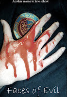
Well as the title clearly indicated we have completed the poster for our film Faces Of Evil.
It started out a bit dreary, looking like this;
I know, awful isn't it? Back when we did this we knew it was pretty poor., but we used this a base idea to build upon.
We loved our image; it's simple yet intriguing and powerful. It conveys the idea of the school massacres through the school logo on the student's blazer and the blood; the hand is quite delicately placed giving a sense of vulnerability, and the blood really stands out from the pale hand and dark clothing.
Apart from knowing that we'd have to add credits etc to our trailer, we weren't too crazy about the font we'd chosen; at the time we were looking for a font that looked like a child's handwriting, but now (as you'll see) we've gone in a different direction.
And now for the good bit, the final product; we're really proud of it and I think looking back you'll agree we've really come on leaps and bounds. Here it is, *insert drum roll*:
Our image's colour/shading etc has had a hell of a lot done to it; the blood now looks more authentic, and the hand looks dirty and in a way, more 'freshly dead' than the previous. Also the blazer has a lot more depth through the different colours, thereby giving it some texture aswell.
The font we went with for our title in the end reminded us of writing on a chalk board; something you'd nearly only see in school. The scratches and breaks in the lettering makes it more sinister. We also added in our slogan "another reason to hate school" which is relatable to teens, as well as the main credits, the film's production company, website and certificate, and a 'quote' from The Guardian.


No comments:
Post a Comment