

Wednesday, 21 April 2010
Friday, 2 April 2010
Evaluation
When it comes to Toderov and Propp’s theories, our film trailer doesn’t seem to follow either of them entirely. Propp’s theory that there are certain types of character that are included in the narrative is loosely followed in our trailer. Although there are main characters that appear more in our trailer than others, it is not clear whether they are a hero, villain etc. This is where our trailer challenges the conventions of Propp’s theory. We did not want to give away in our trailer who was the murderer so we had to include a variety of out main characters to keep the audience guessing.
Toderov’s theory suggests that every narrative follows the pattern of equilibrium, disequilibrium, equilibrium. Our trailer does not follow this theory; our trailer does indeed follow a structure of equilibrium then disequilibrium, but it does not end in equilibrium. Our trailer follows the conventions of a horror trailer; one of these conventions tends to be ending in disequilibrium to excite the audience and draw them in, then leaving them in suspense. Our trailer follows this convention.
Our trailer follows the conventions of other horror trailers; it includes the typical screams, fast pace achieved through editing and shots from the killer’s point of view. Also our music could be seen as conventional to that of a horror trailer, as it creates tension and suspense and keeps in time with the pace of the visual shots.
Our trailer, poster and magazine front covers didn’t really have a house style; we thought it might be more effective to focus on each media product individually and look at what would work best form them as a single piece, rather than try and link them all together and make them similar.
Even though all three products aren’t very similar I think they work together well. While our poster makes the theme of the film very apparent and clear, it also provokes a lot of questions in the audience’s mind; “who is doing this? Why is this happening?” etc. My magazine front cover breaks the conventions of a normal film magazine featuring a horror film. Rather than having an image that is featured in the trailer, or a sinister shot of one of the characters, I decided to do something completely different and have the actors at an award show. I got the inspiration for this idea from the success of Slumdog Millionaire; they won loads of awards before the film was launched in the UK and people were talking about it and anticipating its release because of these award wins.
Our target audience is 15-24; there are a few reasons for this. Firstly this is the age group that tend to go to the cinema the most. Also, our age range could be no younger than 15 because of our age certificate. Finally, we thought this would be the age group most likely to want to see this film because they may either be in full time education or have just left it, making it a more relatable film for them. From our audience feedback (see the blog below) we can conclude that our audience is definitely giving us the reaction we wanted; they are gripped by the trailer and would go to see it if it were in the cinema. Also they understand the plot but are not given away any spoilers as to who they murderer may be. They all liked the trailer the best out of our 3 products and thought they worked well together.
In the research and planning stages of making the three media products, I spent a lot of time looking at real examples of horror trailers, film posters and film magazines. I looked at whether or not the products worked together and why, what made them powerful and whether or not I think the techniques they used would be affective in our three media products.
In the construction stages of our products many different programmes on the computers were used. To construct the poster and the poster and the magazine pictures were taken and we used Photoshop to edit them to how we wanted them to look, for example making the blood on the poster a much deeper red and placing the actors over the ‘backdrop’ on the magazine cover. At first Photoshop was quite hard to figure out, but we got there in the end. Our trailer was edited on Windows Movie Maker, this programme was very easy to use which really helped us get through editing our trailer faster. The music was created and recorded on MAGIXS Music Maker Generation 15, and of course we had to use these blogs to keep track of our progress and present our final products.
Overall I think my trailer, poster and magazine cover were all huge successes which reflects the time, effort and fun that went into making them. If I could do this project again I don’t think there is much I would do differently… maybe have a word with Mother Nature about all the snow putting us behind schedule on our filming :P
Tuesday, 23 March 2010
Audience Response - Interview
Now that our film trailer is finally complete, we're going to look into how our target audience responds to all three of our media types that all advertise the upcoming release of Faces Of Evil. We will record an interview consisting of 14 questions and upload this below. This interview will be given to both men and women in the age range of 15-25; this is because our film is certified as a 15 so no one younger can view this film, and we think that the film is better suited for people below 25 as they're the generation that will have left education more recently.
Note: the magazine cover these four students were shown was the work of Chris Georgiou, so their comments do not apply to my magazine cover. About mine, I got comments such as:
* "it stands out because it's not what you would expect; you would expect to have a sinister image that gives insight to what the film is about."
* "I like the Rising Star Award idea, it shows the success of the film before you've even seen it, and it's a possible award for this film to win."
* "it looks very professional, like you've actually taken the picture infront of that background! Very well put together and a good idea too."
Wednesday, 10 February 2010
Final Magazine Front Cover
It's been a mission and a half, but I've finally finished my magazine front cover :D!

This being an awards special issue, it does not follow the conventions of Sight & Sounds usual style of featuring a new film release on the front cover. Apart from this helping my magazine to stand out from the 'regular' issues, this allowed me more freedom to do what I wanted with my front cover.
The front cover features the two main actors in the film, Mel Higgs and Chrisfa Georgiou. They appear to be standing in front of a 'press board', which actors and actresses would be photographed and interviewed infront of at movie premiers and the like. This is infact is a repeated image that I created myself and then photoshopped the two characters onto it, creating the illusion that they were actually pictured infront of this.
The typical Sight & Sound yellow header features on this front cover. The '2009 Awards Special' font is bold and jumps out at you against Chrisfa's black clothing. The font could also be seen to look like the letters are lit up.
The red font on Mel's grey dress matches the red on the 'Film 4' logo in the background. This colour stands out well and helps to emphasise the 'Faces Of Evil' logo. The font used for this logo is the 'official' font used in the trailer and on the film poster; the outline has been made thicker to put an even bigger emphasis on the film title, which should catch the eye of the reader.
Monday, 8 February 2010
Sight & Sound Magazine - Research
First off I haven't blogged in ages coz I've had tonnes of other things going on, and the group's main focus has been finishing our filming.
I've almost completed my magazine front cover, and thought a brief insight into Sight & Sound magazine might help me to express why I chose to use this magazine and whether or not my front cover follows or goes against the conventions of Sight & Sound.
* Published by the BFI, Sight & Sound magazine was first published in 1932. It didn't start getting published monthly until 1991 when it started to feature the 'Mothly Film Bulletin'.
* Sight & Sound has a more 'highbrow' reputation than other film magazines. It says it reviews all film releases each month, including those with a narrow art house release, as opposed to the more mainstream focus of its competitors.
* Sight & Sound also currently features a full cast and crew credit list for each reviewed film.
* Sight & Sound has in the past been the subject of criticism, and accused of "elitism, puritanism and upper-middle-class snobbery" by some.
* Every decade, Sight & Sound asks an international group of film professionals to vote for their greatest film of all time. Critics are asked to provide a top ten list; in 1992, directors were invited to participate in a separate poll. The individual results are eclectic; in the most recent poll, 885 different films received at least one mention from one voter.
* The Sight & Sound accolade has come to be regarded as one of the most important of the "greatest ever film" lists. Roger Ebert (American film critic and screen writer) described it as "by far the most respected of the countless polls of great movies--the only one most serious movie people take seriously."
* The first poll, in 1952, was topped by Bicycle Thieves (1948 Italian neorealist film directed by Vittorio De Sica).


Thursday, 26 November 2009
Film Poster Complete!
Haven't posted a blog in ages, and we've got so much done!
 I know, awful isn't it? Back when we did this we knew it was pretty poor., but we used this a base idea to build upon.
TADA! haha. We're so proud of the final product, and have had several comments from friends saying it looks like a real film poster :)!
Well as the title clearly indicated we have completed the poster for our film Faces Of Evil.
It started out a bit dreary, looking like this;
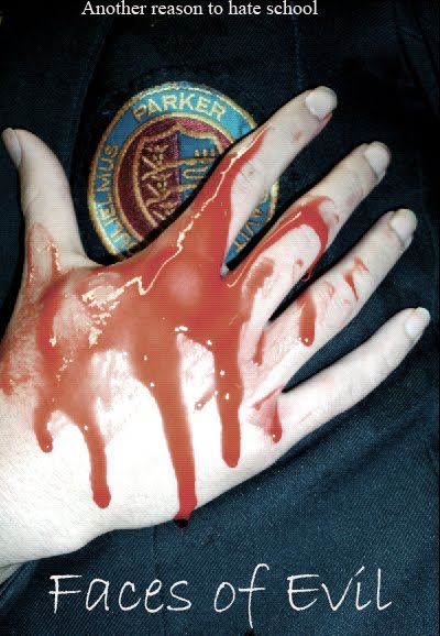
We loved our image; it's simple yet intriguing and powerful. It conveys the idea of the school massacres through the school logo on the student's blazer and the blood; the hand is quite delicately placed giving a sense of vulnerability, and the blood really stands out from the pale hand and dark clothing.
Apart from knowing that we'd have to add credits etc to our trailer, we weren't too crazy about the font we'd chosen; at the time we were looking for a font that looked like a child's handwriting, but now (as you'll see) we've gone in a different direction.
And now for the good bit, the final product; we're really proud of it and I think looking back you'll agree we've really come on leaps and bounds. Here it is, *insert drum roll*:

TADA! haha. We're so proud of the final product, and have had several comments from friends saying it looks like a real film poster :)!
Our image's colour/shading etc has had a hell of a lot done to it; the blood now looks more authentic, and the hand looks dirty and in a way, more 'freshly dead' than the previous. Also the blazer has a lot more depth through the different colours, thereby giving it some texture aswell.
The font we went with for our title in the end reminded us of writing on a chalk board; something you'd nearly only see in school. The scratches and breaks in the lettering makes it more sinister. We also added in our slogan "another reason to hate school" which is relatable to teens, as well as the main credits, the film's production company, website and certificate, and a 'quote' from The Guardian.
Thursday, 19 November 2009
Theory
There are two main theories that can be applied to films and their trailers;
Todorov (1969): Todorov's theory suggests that all narratives follow a three part structure of equilibrium, disequilibrium, and equilibrium again. An equilibruim is a stable situation, which in this situation could be the scene setting and happy ending of a film. Therefore disequilibrium is the opposite of this; it is the loss of control and stability in the equilibrium, such as things going wrong for the characters. A lot of films will follow this theory, such as Back To The Future and The Number 23. However both our film and trailer do not follow this theory; we end both without a second equilibrium. Our trailer is left to end in disequilibrium to keep it thrilling through to the end, which will keep the audience's attention and make the film more exciting and desirable to watch. Our film is also left in disequilibrium because a sequal is to follow, so the audience is left wanting more and will therefore want to watch the follow up film.
Propp (1969): Propp's 'theory of character' suggests that there are certain types of character, and these characters crop up most in film narratives. The most important of these are the hero, the villain, and the doner. A complex example of this theory is The Dark Knight; while Batman is the main hero and The Joker is the main villain, the character Harvey Dent starts out in the film as a hero, but slowly progresses into a villain throughout. Both our film and trailer follow this theory. They both feature the 'main characters' most often and have specific and obvious character types.
Wednesday, 14 October 2009
Representation
The Queen (2006) is the perfect example of how representation is a major factor in the film industry. I look at two different trailers for the film, one American and one British, and there are vast differences in what the trailers portray.
Trailer 1: http://www.youtube.com/watch?v=tS3bX3umi0M
The American trailer features a lot of bright shots of the countryside, people drinking tea and other stereotypical British symbols. It also features a lot of close up to capture the emotions of the Queen and the Prime Minister. This trailer depicts England as a nation mourning the death of Princess Diana side by side as opposed to people's individual greif. Also text flashes up in golden writing which could represent the crown, and this writing is on a black background which could represent the mourning.
Trailer 2: http://www.youtube.com/watch?v=J1Wu0qGEev4
The British trailer however, depicts the Queen a lot more isolated from the nation and focuses on her as an individual person. She is portrayed very much as I think the people of England like to see her; as a strong woman full of pride and good intentions, even though it shows her feeling sorrow and confusion, which makes her relatable. The setting is a lot more realistic than that shown in the American trailer; the colours aren't as bright and a lot less stereotypical.
Production and Distribution
We have chosen Pathé to be both the production and distribution company for our film.

Pathé is a company that have helped to produce and distribute many successful films including The Queen (2006) which won over 20 awards including a BAFTA for Best Film. We thought this company would be suitable for our film because it's a large corporation made up of lots of little companies, and even though their British Film Company is smaller than e.g. Working Title they have had a lot of marked success.
Monday, 28 September 2009
The Start of Filming

Last week we began filming our trailer.
We filmed a shot in which the audience are put into the caretaker's perspective when he is being intimidated by the students of the school he is working at.
To film this we had a group of school students stand in a circle surrounding one of my team who was sitting on an office chair. Then as the scene was recorded the one filming would spin slowly as the students all jeered abuse at them.
This creates a feel of vulnerability as the audience is surrounded and the students are filmed at a low angle which makes them seem empowered.
Tuesday, 22 September 2009
Inspiration
In 2002 Holly Wells and Jessica Chapman were murdered by their school caretaker Ian Huntley. As our film features a caretaker suspected of murdering students at his school this real life tragedy could be seen as an inspiration for our film.

Wednesday, 16 September 2009
Update
Here's a list of what my group has done recently to contribute to our film trailer making:


We like that these posters are so simple in design yet very effective and eye-catching. Both posters are distorted in some way which could reflect how the villains have 'lost their way' and become insane. We want to try to incorporate this into our own film poster to reflect the distorted reality the school children seem to be in. We also like the use of dark colors, particularly red, as the makes the poster look more sinister, which again will be used in our poster. We like the idea of these posters being quite easy and predictable but they are made to be very unique to the film and it's theme, which is another thing we would like to incorporate into our work.
Filming practice;
We started to practice different filming techniques by making a few short films, one of which I have uploaded above. All the short films had different themes, such as the one above which is a two person perspective.
Cast recruiting for the trailer;
Although some of our actors are yet to be confirmed, we have the following people in mind:
- Steve Wood - Caretaker (confirmed)
- Mr. Casebourne - Teacher (confirmed)
- Mr. Davies - News Reporter (confirmed)
- Mel, Chris & others - Students (confirmed)
Poster Inspiration;
Our poster idea is mainly influenced by the posters for the 2008 film The Dark Knight.


We like that these posters are so simple in design yet very effective and eye-catching. Both posters are distorted in some way which could reflect how the villains have 'lost their way' and become insane. We want to try to incorporate this into our own film poster to reflect the distorted reality the school children seem to be in. We also like the use of dark colors, particularly red, as the makes the poster look more sinister, which again will be used in our poster. We like the idea of these posters being quite easy and predictable but they are made to be very unique to the film and it's theme, which is another thing we would like to incorporate into our work.
Monday, 27 July 2009
The Pitch
Even though we tried getting a few laughs out of our presentation I feel we still maintained an informative and well structured film pitch. We included a lot of information about our inspiration and ideas, as well as giving examples of directors that have produced work we would like to incorporate into our own piece. If we had to do the pitch again I think we could have made it more serious and mature to come across professionally.
Thursday, 11 June 2009
Genre
What is genre?
'Genre' derives from the french meaning of 'kind' or 'sort'; it's the name given to catagories films, music etc are put into according to certain criterias they meet.
Why do audiences, producers and distributors need to know the genre of a film?
The audience would like to know the genre of a film before seeing it so that they know whether the film is their taste and therefore not a waste of time and money. Producers need a clear idea of the film's genre so that they know what direction they need to go in in order to make their film a success and what techniques to use in order to make this possible. Finally, the distributors might need to know the genre of the film so that they have an idea of what sort of success it is going to have in their particular, and more importantly, they would then know how to advertise the film efficiently and effectively.
We looked at several horror trailers from decades ranging from the 60s to modern day. Their structures differed but their effectiveness tended to stay quite powerful. My examples are Psycho (1960) and The Hills Have Eyes (2006).
Psycho (1960): the trailer for this film is over 6 minutes long, which is easliy double the time of a modern-day trailer, and filmed in black and white. Also, there are no scenes from the film featured in the trailer at all; Alfred Hitchcock, the director of the film, escorts us round the set of the film and almost tells us the story line, every now and again dropping little hints to us then moving swiftly on. Although this is cheesey and probably wouldn't be effective today, back in the 60s this might have been effective because people would want to know what they should be expecting to see when they watch this film and would want to know what happens in the end.
The Hills Have Eyes (2006): this full-length trailer is only just over 2 and a half minutes long, and yet it is packed with ten times the action and thrill of the Psycho trailer; it's bright vivid colours in the desert reflect the harsh heat on the sand, and the vast wasteland surrounding them reinforces their isolation from civilization. It gives you a clear idea of what the film is about, but at the same time doesn't give too much away, and uses lots of fades and crossfades.
The adult in the tracksuit is portrayed as being in charge; this is reinforced with close up shots of him smiling at the chaos around him and the teenagers scream and try to escape. Usually there would be low angled shots of the villain, however this convention is not followed in this trailer, as we are eye-level with this man. This is because the audience is in just as powerful position as he is, as we oversee the island as he does in the film.
Audiences will be able to sympathise with the teenager's desperation to live but the painful dilema of knowing that in this situation, living means killing your friends. The bond between these students is particularly highlighted when just before one of the boys' necklaces blows up he and his best friend reach out to each other in desperation knowing there is no way of saving him now. At the start of the trailer the shots are cross-faded into one another, which could put emphasis on them traveling. We never get to know the teens individually which makes them seem more like the 'game-pieces' they are rather than actual people; they're more 'robotic' this way.
'Genre' derives from the french meaning of 'kind' or 'sort'; it's the name given to catagories films, music etc are put into according to certain criterias they meet.
Why do audiences, producers and distributors need to know the genre of a film?
The audience would like to know the genre of a film before seeing it so that they know whether the film is their taste and therefore not a waste of time and money. Producers need a clear idea of the film's genre so that they know what direction they need to go in in order to make their film a success and what techniques to use in order to make this possible. Finally, the distributors might need to know the genre of the film so that they have an idea of what sort of success it is going to have in their particular, and more importantly, they would then know how to advertise the film efficiently and effectively.
***
We looked at several horror trailers from decades ranging from the 60s to modern day. Their structures differed but their effectiveness tended to stay quite powerful. My examples are Psycho (1960) and The Hills Have Eyes (2006).
Psycho (1960): the trailer for this film is over 6 minutes long, which is easliy double the time of a modern-day trailer, and filmed in black and white. Also, there are no scenes from the film featured in the trailer at all; Alfred Hitchcock, the director of the film, escorts us round the set of the film and almost tells us the story line, every now and again dropping little hints to us then moving swiftly on. Although this is cheesey and probably wouldn't be effective today, back in the 60s this might have been effective because people would want to know what they should be expecting to see when they watch this film and would want to know what happens in the end.
The Hills Have Eyes (2006): this full-length trailer is only just over 2 and a half minutes long, and yet it is packed with ten times the action and thrill of the Psycho trailer; it's bright vivid colours in the desert reflect the harsh heat on the sand, and the vast wasteland surrounding them reinforces their isolation from civilization. It gives you a clear idea of what the film is about, but at the same time doesn't give too much away, and uses lots of fades and crossfades.
***
Battle Royale
Above left is a trailer for the 2001 film Battle Royale. This trailer shows a group of teenage school students depicted as 'players' in a viscious game of survival of the fittest. The pace is fast and the repetitive music creates tention as the panic amoungst the students mounts, particularly when the adult in the tracksuit tells them the prize for winning the game is their life.
The adult in the tracksuit is portrayed as being in charge; this is reinforced with close up shots of him smiling at the chaos around him and the teenagers scream and try to escape. Usually there would be low angled shots of the villain, however this convention is not followed in this trailer, as we are eye-level with this man. This is because the audience is in just as powerful position as he is, as we oversee the island as he does in the film.
Audiences will be able to sympathise with the teenager's desperation to live but the painful dilema of knowing that in this situation, living means killing your friends. The bond between these students is particularly highlighted when just before one of the boys' necklaces blows up he and his best friend reach out to each other in desperation knowing there is no way of saving him now. At the start of the trailer the shots are cross-faded into one another, which could put emphasis on them traveling. We never get to know the teens individually which makes them seem more like the 'game-pieces' they are rather than actual people; they're more 'robotic' this way.
Subscribe to:
Comments (Atom)